
Pravha // brand launch //
‘How to successfully launch a new beer… don’t do work that looks like every other beer ad’
When tasked with launching the beer brand Pravha, I looked at the bottle and noticed a tiny piece of writing printed on the collar: "bold flavour and light taste." At first, I thought, "What does that even mean?" Then it clicked—this was our entry point. This unexpected combination of "light and bold" became our way in.
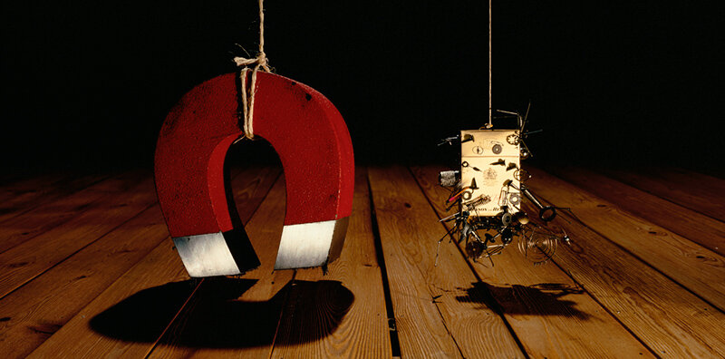
Next, we had to find the right tone of voice. Our ambition was to be premium, playful, and intelligent.
We needed to stand out in a world dominated by BIG PINT! beer advertising (and let’s face it, we didn’t have the budget to take them head-on).
I kept coming back to cigarette posters from the '80s and '90s. I loved their attitude—beautiful posters that you wanted to look at, but also made you think (imagine that). So, I started pulling them apart to build the Pravha world.
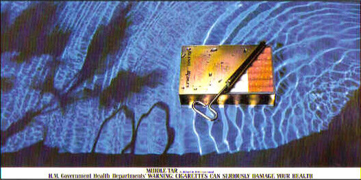
We took the distinctive duck egg green color palette and set out to own it.
We then commissioned two of London’s best fashion still life photographers, Metz+Racine, and told them: "Don’t make a beer ad with the bottle plonked in the bottom right. Treat it like a fashion object."
(We also doubled down on our still shoot and created simple films, incorporating ‘bold and light’ sound design.)
And we kept the messaging straightforward—just talking about the product. No lofty nonsense about how “you’ll be more of a person if you drink it.”
This approach led to what became Molson Coors' most successful launch to date.


I also worked on a year-two follow-up campaign, staying within the same world and tone of voice. This time, the idea was built around “Who said light can’t be bold?” (Photoshop mockups below).


